This page lists improvements to the AWR Design Environment for visualizing and analyzing data.
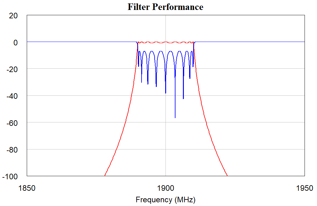
Change Axis Limits and Step Sizes Directly on a Graph
The project opens and displays a "Filter Performance" graph.
Double-click the x-axis value 2400 MHz and type 1950, then press Enter.
Double-click the x-axis value 1500 MHz and type 1850, then press Enter.
Double-click the y-axis value -400 and type -100, then press Enter.
Double-click the y-axis value 0 and type 20, then press Enter.
Axis limits are easily modifiable inline.
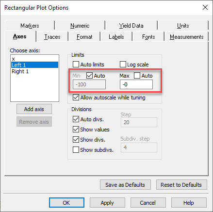
Create Legible Graphs with Independently Controlled Auto Axis Limits
The project opens and displays a "Filter Performance" graph.
Right-click on the "Filter Performance" graph and choose Options to display the Rectangular Plot Options dialog box.
On the Axes tab, select the Left 1 axis and then clear the Auto limits check box.
Independent control of the axis limits is now available.
Clear the Auto check box for the Max axis and change the Max value to 20.
Choose Simulate > Tune to open the Tuner and tune on the variable.
The minimum value scales automatically, but the maximum now stays at a constant value that makes the graph more legible.
Match Marker Colors to Trace Colors
The project opens and displays a graph showing passband and stopband.
Right-click on the "Passband and Stopband" graph and choose Options to display the Rectangular Plot Options dialog box.
On the Markers tab, select select the Match text color to trace check box and then click OK.
Markers now match their trace colors for easy identification.
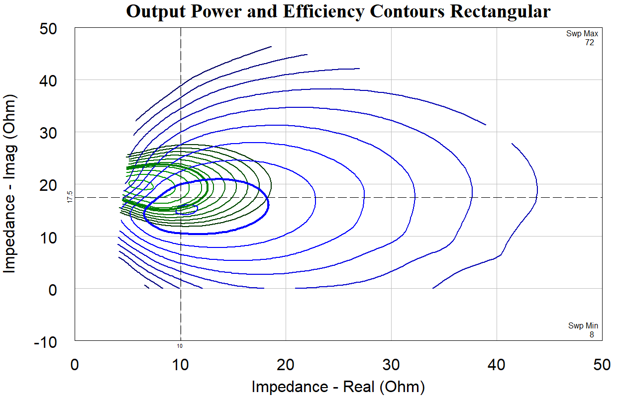
Manage Vertical and Horizontal Line Markers
The project opens and displays an "Output Power and Efficiency Contours Rectangular" graph.
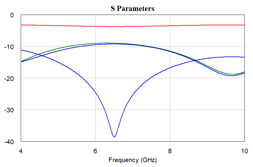
The graph contains both horizontal and vertical line markers.
Note the line marker values displayed at the edge of the graph data.
Select the horizontal line marker, and with the marker selected, press the Shift key while pressing the Up/Down arrow keys.
The line marker moves one tenth of a graph division for easy and accurate placement.
Right-click the horizontal line marker and choose Move Line Marker, then enter a New value to place the line marker.
Hide Non-critical Data on Graphs
The project opens and displays an "S Parameters" graph.
Choose Options > Environment Options to open the Environment Options dialog box.
On the Project tab, clear the Disabled measurements in legends and Disabled goals draw on graph check boxes, then click OK.
NOTE: Environment options are saved per user, not per project, so at the end of this demo reset them to your preference.
Simulate again by clicking the Analyze button on the toolbar or by pressing the F8 key.
Disabled measurements and optimization goals no longer display on graphs.
Open the "Return Loss" graph and maximize the window.
Right-click on the graph and choose Options to display the Smith Chart Options dialog box.
On the Format tab, clear the Sweep min/max check box, then click OK.
The minimum and maximum sweep values no longer display.
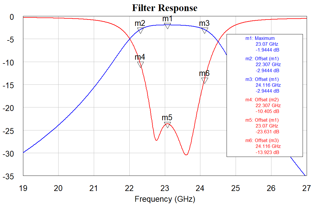
Set Up Data Visualizations with Cross-measurement Reference Markers
The project opens and displays a graph set up to add offset markers.
Right-click on the graph and choose Add Offset Marker.
In the Add Offset Marker dialog box, set the Reference Marker to m2, the x offset to 0, and then click Select Trace.
Click the red RL curve to add the offset marker to this curve.
Repeat the above steps for markers m1 and m3.
Open the Tuner by pressing the F9 key or by clicking the Tune button on the toolbar.
Tune on the structure. The offset markers on the RL curve track the markers on the IL curve.
Plot X-axis-less Data
The project opens and displays the "PAE at 4 dB Compressed From Max Gain" graph.
In previous AWR Design Environment versions this type of data visualization was not possible to graph; x-axis designations in measurements were required.
Double-click the measurement in the "PAE at 4 dB Compressed From Max Gain" graph to open the Measurement Editor.
NOTE: There is no x-axis designation for any of the measurement parameters.
In this example the power added efficiency (PAE) is plotted for all gammas at a specified compression level.
Click on the traces and view the tooltip. You can easily see the gamma at which the highest efficiency occurs.
The ability to plot x-axis-less data allows many more graphing and visualization opportunities.
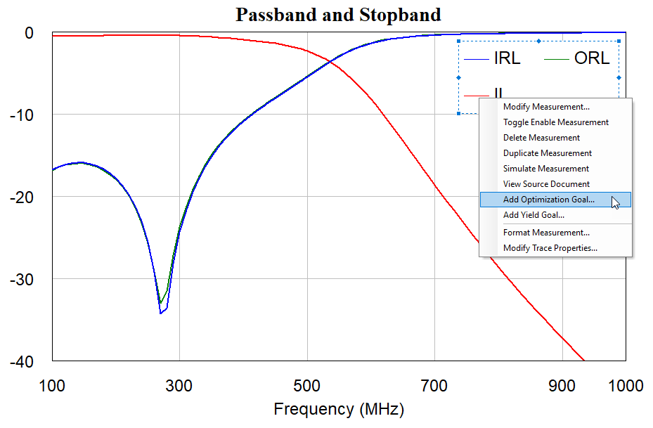
Add and Edit Optimization and Yield Goals from within a Graph
The project opens and displays the "Passband and Stopband" graph.
Right-click on the IRL measurement in the graph legend and choose Add Optimization Goal.
Draw the optimization goal from 100 Mhz to 500 Mhz at a y-value of -20.
Note the snapping grid for optimization goal placement. To ignore this grid, press the Shift key while drawing the optimization goal.
Repeat this process for the ORL measurement at a y-value of -30.
Select the ORL optimization goal; drag handles display.
Select the left drag handle and drag the left endpoint of the optimization goal up to -20.
Note the snapping grid for modifying the placement of the optimization goal. To ignore the snapping grid, press the Shift key while moving the drag handles.
Use Equation Grouping to Speed Equation Organization