This page lists improvements to the AWR Design Environment for visualizing and analyzing data.
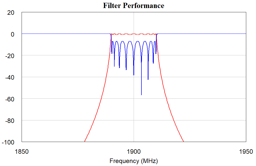
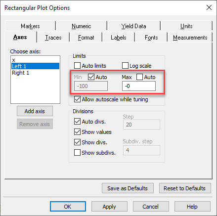
Change Axis Limits and Step Sizes Directly on a GraphThe project opens and displays a "Filter Performance" graph.
|
|
|
|
|
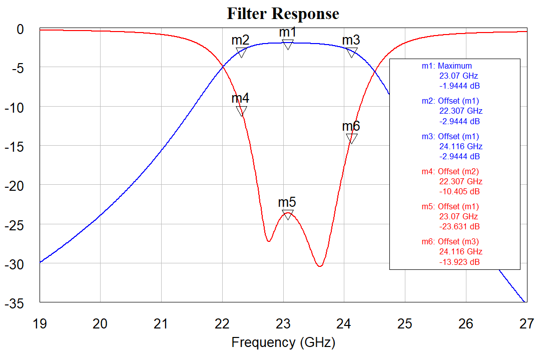
Create Legible Graphs with Independently Controlled Auto Axis LimitsThe project opens and displays a "Filter Performance" graph.
|
|
|
|
|
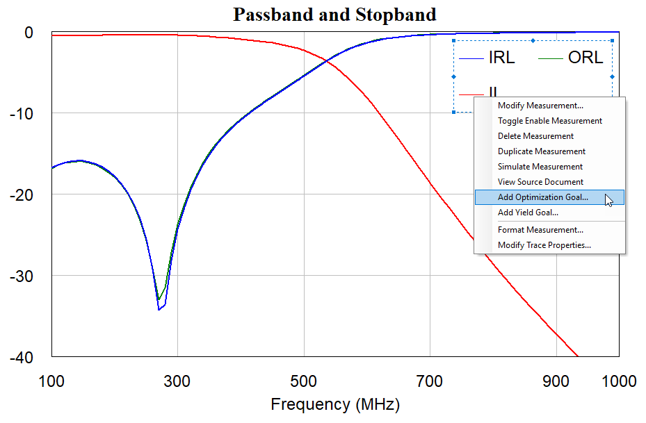
Match Marker Colors to Trace ColorsThe project opens and displays a graph showing passband and stopband.
|

|
|
|
|
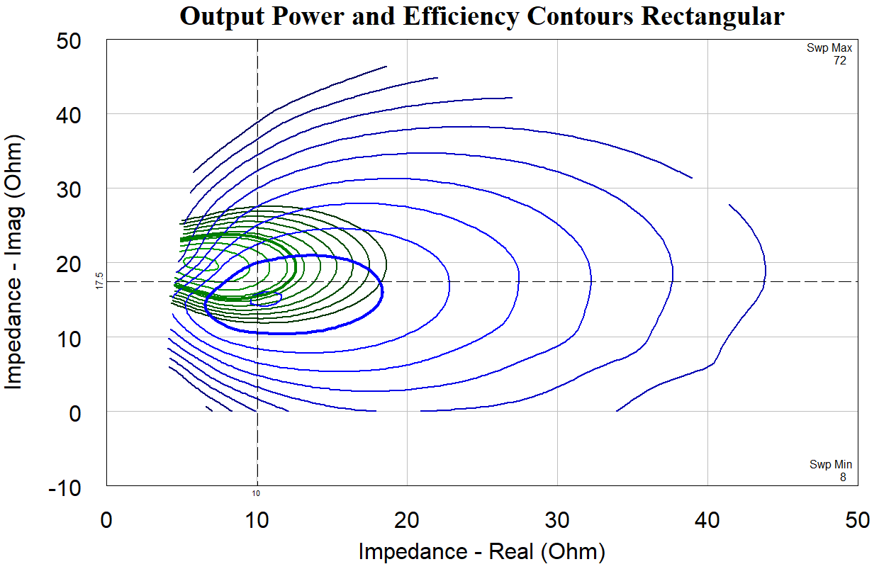
Manage Vertical and Horizontal Line MarkersThe project opens and displays an "Output Power and Efficiency Contours Rectangular" graph.
|
|
|
|
|
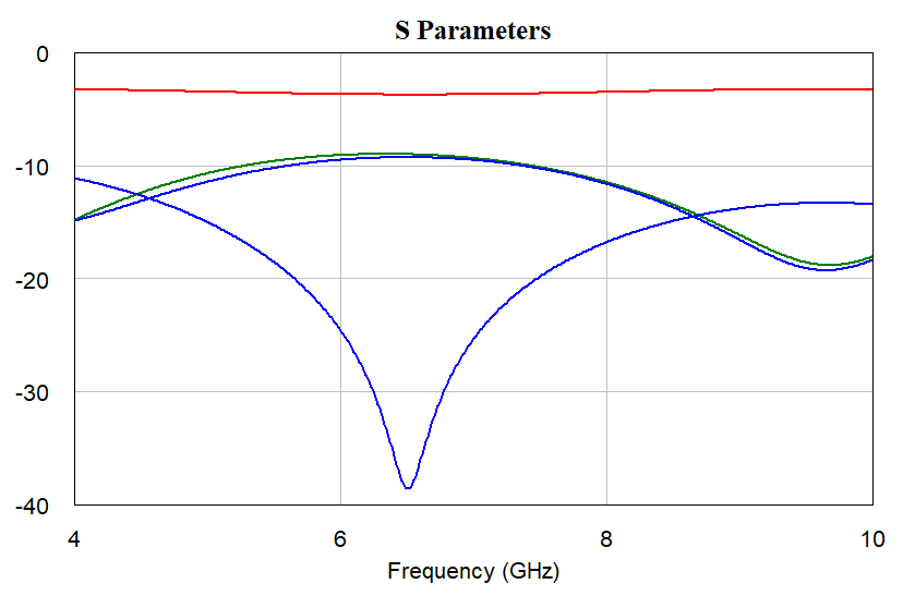
Hide Non-critical Data on GraphsThe project opens and displays an "S Parameters" graph.
|
|
|
|
|
Set Up Data Visualizations with Cross-measurement Reference MarkersThe project opens and displays a graph set up to add offset markers.
|
|
|
|
|
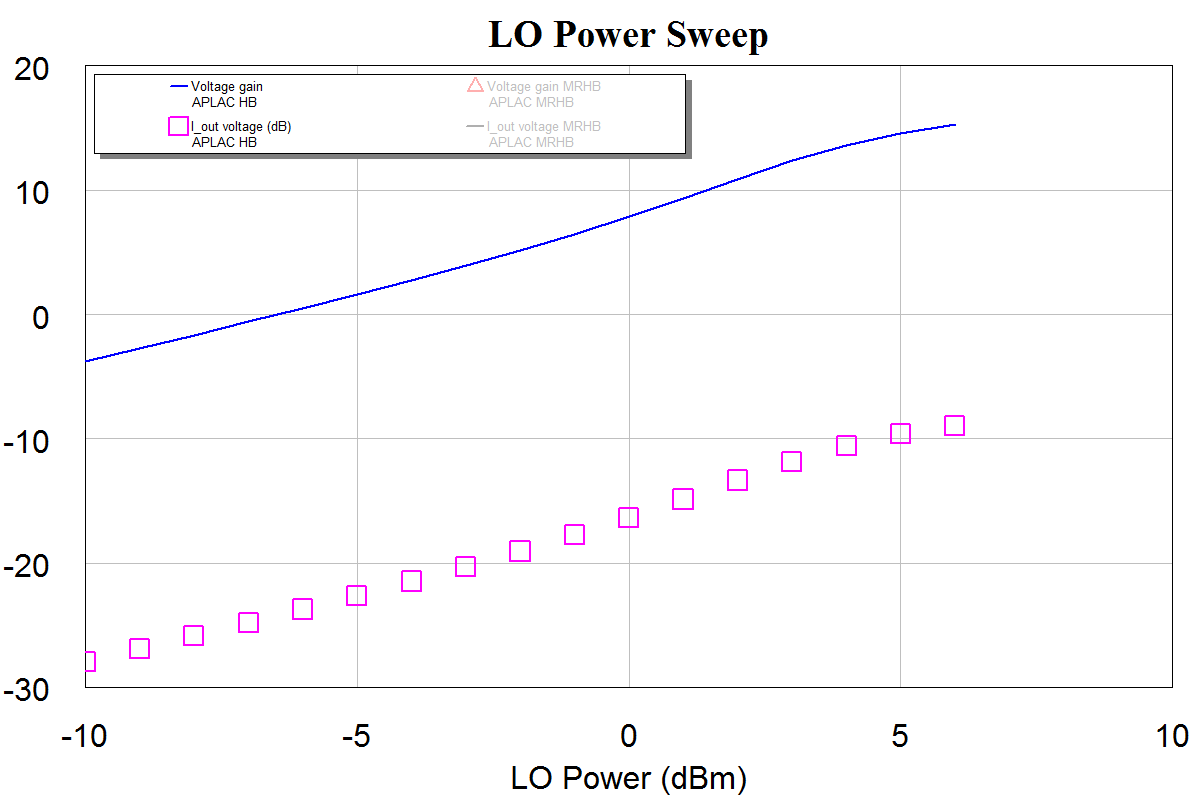
Plot X-axis-less DataThe project opens and displays the "PAE at 4 dB Compressed From Max Gain" graph.
|

|
|
|
|
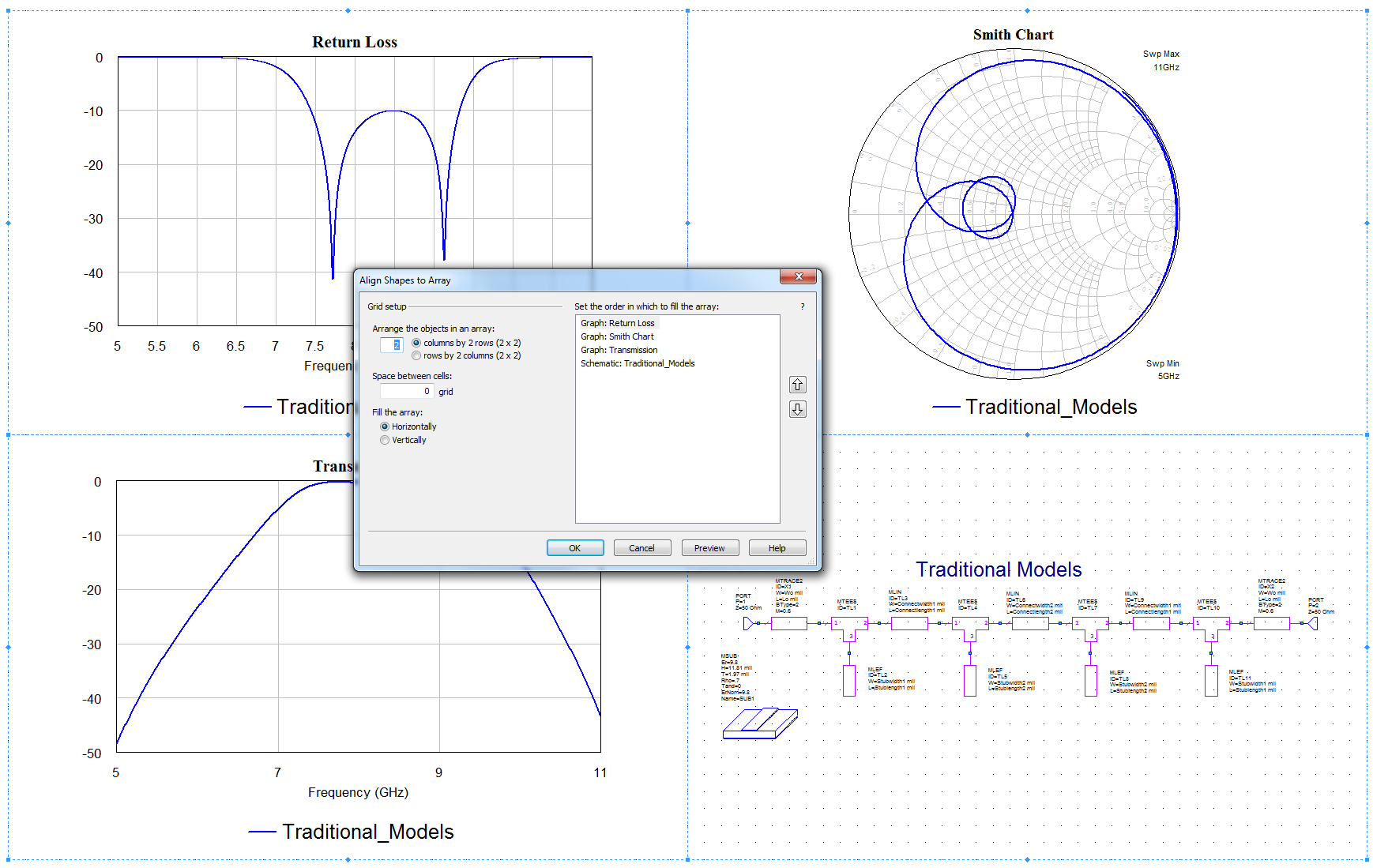
Add and Edit Optimization and Yield Goals from within a GraphThe project opens and displays the "Passband and Stopband" graph.
|
|
|
|
|
Use Equation Grouping to Speed Equation Organization |
|
This page contains improvements to the AWR Design Environment for visualizing and analyzing data.
Create design-review-ready data reports with just a few mouse clicks.Use the Insert Windows Command to generate pre-sized, pre-arranged Window in Window reportsThe demo opens the project and opens a blank Output Equations page
|
|
|
|
|
Tired of editing lots of measurements to change data sources or measurement parameters? Centralize control with DOC_SETs and Output Equation variables. |
|
|
|
|
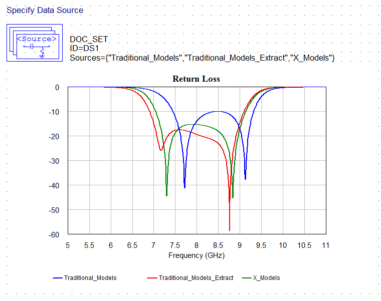
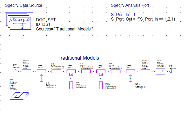
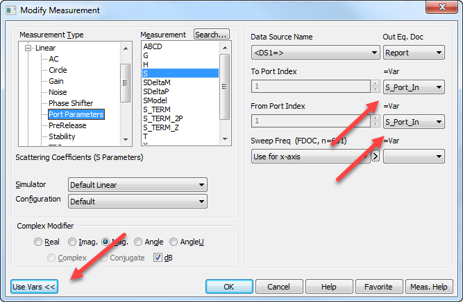
Centralized control of measurement data sources and parametersThe new DOC_SET element adds a way control Measurement Data Sources in a single location rather than editing many Measurements at once to change the Data Source. Similarly, using Output Equation page variables in Measurements allows centralized measurement parameter control for quick, easy updates in one location The demo opens the project, maximizes an Output Equations page, simulates, and opens the tuner.
|
|
|
|
|
Exploring DOC_SETs and variables in Measurement parameters
|
|
|
|
|
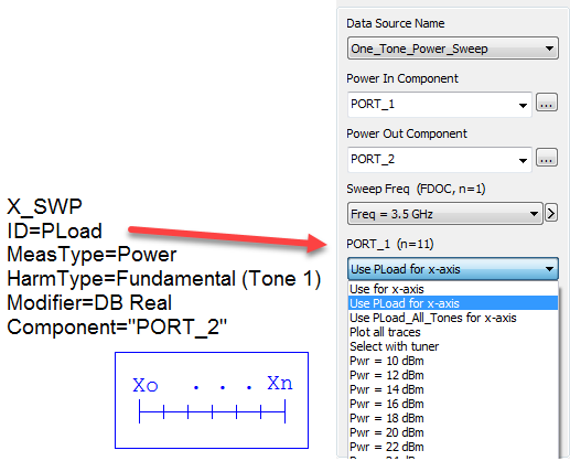
Effortlessly plot any measurement vs. output power.Plotting vs. Output Power with X_SWPThe demo opens the project, maximizes an Output Equations page, simulates License requirements: Nonlinear simulator (MWO-2XX)
|
|
|
|
|
Personalize Graphs with infinite trace color choices. |

|
This page contains improvements to the AWR Design Environment for visualizing and analyzing data.
Why wait until your simulation is complete to see answers? See live simulation results while the simulation is running.See Simulation Results While Simulation RunsThe demo opens the project and maximizes a graph to show the waveforms as they are available from the simulator after the simulation starts.
|
|
|
|
|
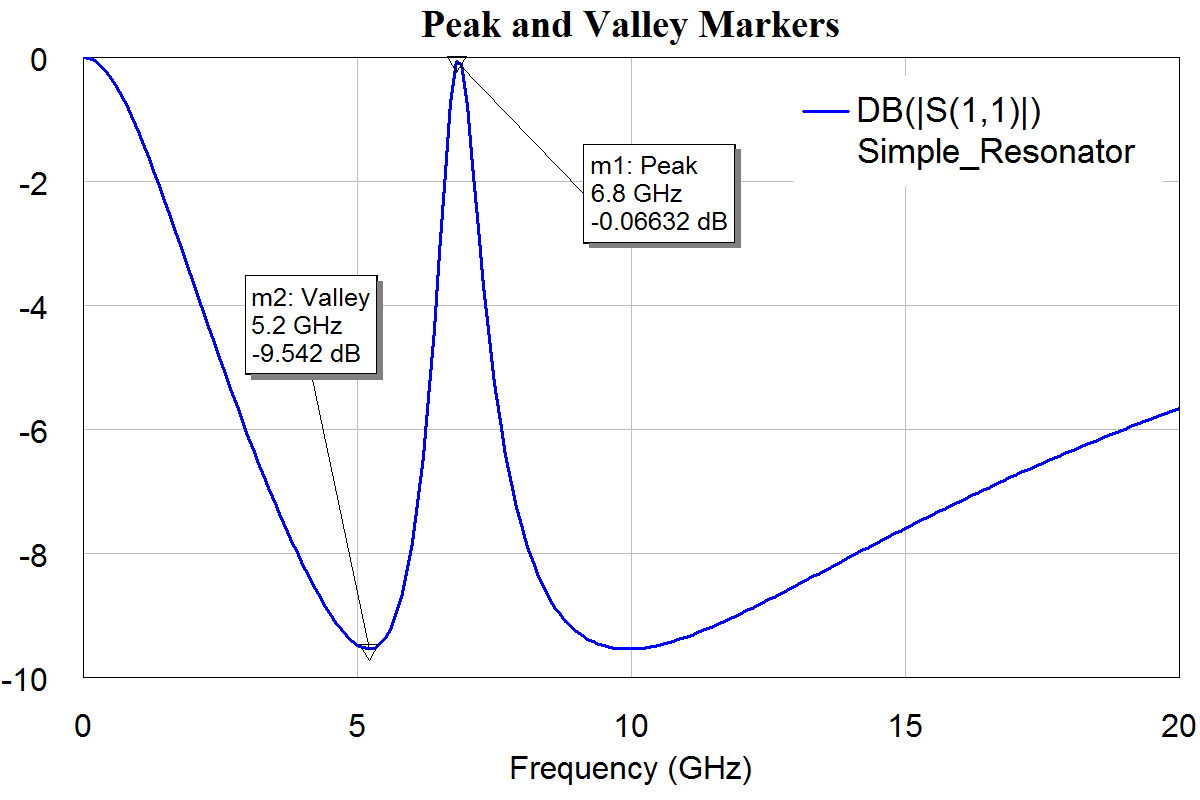
Explore results with intelligent data markers that lock to metrics such as maximum gain or 3 dB roll-off frequency.Intelligent Markers Based on Performance SpecificationsThe demo opens the project, tiles graphs for each new marker type, simulates and opens the tuner.
|
|